This might be the last good image I pulled off the gelli plate. (Technically it is a monoprint in acrylic on heavy paper.) I rather like this image but it was surrounded by too many others best suited for collage work. Sorry for the distortion in the photo. I am inept with a camera.
I’ve completed my first commission and had my first disagreement with a client. “That’s not what I asked for,” was the comment. “Well, that’s what I could make today,” I answered. Eventually I found a way to make it acceptable to the client and harmony was restored to the marriage. Yeah, my wife was my first commission.
She liked “Jason’s Tiles” but didn’t think blue would work in her kitchen, so we produced 20 more imprints in this green-green (two colors, pale green and bright green) 4″ x 4″ on while paper arranged and assembled in a four tile panel on green card stock.
This summer, my son and his husband, Jason, went to Portugal to look around. One of the pictures Jason sent back was this lovely, Old World tile. I was so intrigued by it, I decided to duplicate it. Because I wanted to learn something about two-block technique that’s the way I set this experiment up. So far I have a run of 20 of these “tiles” but I’ve left the edition open to make different presentations and perhaps different colors in the future. Watch this space for assemblage pieces.
As seen here it is just under 4″ x 4″ (like real tiles). Printed in water-based inks, mounted on card stock.
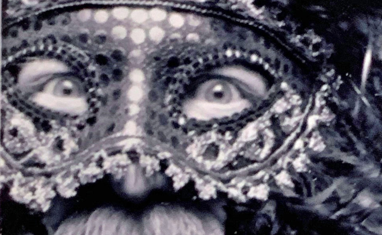
This is the most complex print I have attempted to date. It is called “Donielle’s New Hat.” There was never really any other title possible. Donielle is a friend and she gave me permission about a year ago to do this rendition of her photo. I had to wait while my skills grew into the endeavor.
It is a reduction linocut of 6 layers with the hand-painted earrings in a 7th color printed on vellum and mounted on backing paper of an 8th color. I am satisfied with it despite some technical issues.
It is a 4.5″ x 8.5″ print mounted on 8.5″ x 11″ paper and backing framed in a 9″ x 13″ frame. This is 1 of 13 in the world.
This is from a photo I saw somewhere. I’m not trying to steal anything. But it is dedicated to Mr. and Mrs. Thompson (you know who you are). The traditional VW with “birth control” seats, was an icon of the 60s among a certain class of drivers. This image tries to evoke the spirit of that era. No print is perfect and the four layers of this print each created a different challenge. BUG 1 is a lino cut 4-layer print of 6.5″ x 6″ on paper. Limited edition of 12.
Finding the right color for a personality can be easy as pink for Sweetie or as hard as lime green for Hank. Teddy is getting the royal purple treatment. Here he is in everything from blue-purple to red-violet. It has been a great experience inventing this series and Teddy is the fourth suit in the deck.
There are at least 13 of these 5×8 prints and a couple of artist proofs. (also some seconds with too much carving chatter for my taste).
One thing about being on Prednisone is that you get stuff done! Here is my newest print of a Grandchild, Henrick. At two and a half, he is wise beyond his years. Look at that heroic pose!
There are 13 of these, 5″ x 8″ on the same translucent paper the others are on with a blue backing. Working out how to mat these prints. They may require a hand tinted mat or something.
This is second in the series of grandkids. Meet Elinor who is everything pink. Pink on pink is soooo appropriate for her. This is the first proof off the press, so there might be a couple of the most minor tweaks to this in the issue of 12 and at least 2 Artist Proofs.
Again, we are printing on translucent paper (what we once referred to as “vellum”) and overlaying it on a hot pink backing sheet. Will probably frame in black because I like the look and pop it provides. 8″ x 5″ on 8.5″ x 11″ paper.
Not too happy with the ragged edge on the frame, but I can clean that up in subsequent prints by using a softer brayer to distribute the ink. We call her “Sweetie” for a reason!
These photos are the first in a series of four (unless I can get my other grands involved). This is a representation of grandson #1, Henrik. You see two images both printed on translucent paper. The first shows the paper on top of the printing bed of my press and you can see the registration marks in blue painters’ tape showing through. The second is how I want to present the image in a frame (probably with a mat). It is lying on top of a sheet of lime green paper. Henrik claims lime green is his favorite color.
Note how laying the green on top of the green, seems to mute the “Joker-like effect” to the image. I’m holding two thumbs up. Three more in the works.
5.5″ x 8″ on translucent paper, limited edition of 12 plus two AP.
Another new (to me) idea for a print. This is Johanna. She is based on someone else’s drawing but in a style I’m trying to adapt for simplistic portraits. Johanna is 5.23″ x 6.75″ on 8.5″ x 11″ paper (note the increase in size from previous prints…the new Woodszilla!)
I also have discovered printing on “translucent” paper. It is akin to what we once called vellum. When mounted over a colored backing it permits some of the tint from the backing paper to come through. Watch for future experimentation.
BTW, why Johanna? Well, I carved this one night when I couldn’t sleep. I got up at about 4:30 and I worked on her until past sunup. I had Bob Dylan on the headphones at one point, as the sun was rising, he sang, “And these visions of Johanna, they kept me up past the dawn.”
How could she be anything else? Edition of 12 plus A/P.