This is second in the series of grandkids. Meet Elinor who is everything pink. Pink on pink is soooo appropriate for her. This is the first proof off the press, so there might be a couple of the most minor tweaks to this in the issue of 12 and at least 2 Artist Proofs.
Again, we are printing on translucent paper (what we once referred to as “vellum”) and overlaying it on a hot pink backing sheet. Will probably frame in black because I like the look and pop it provides. 8″ x 5″ on 8.5″ x 11″ paper.
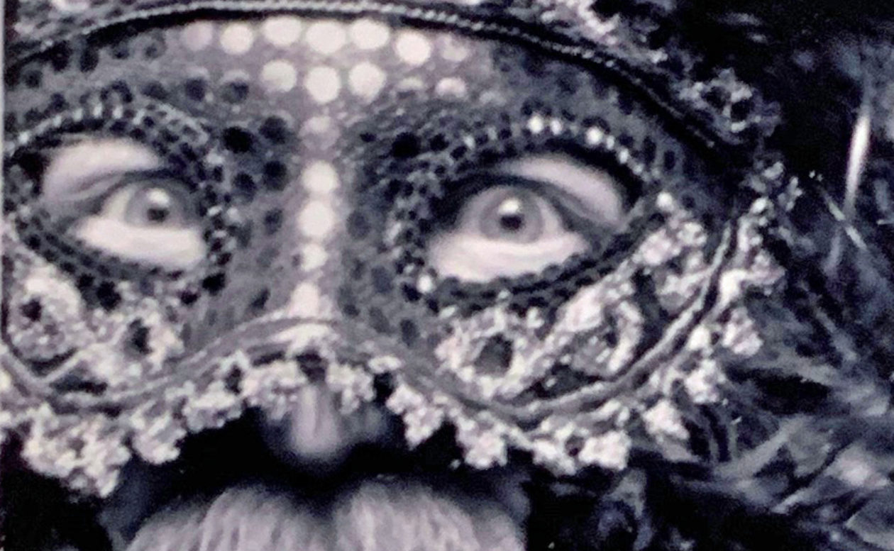
Not too happy with the ragged edge on the frame, but I can clean that up in subsequent prints by using a softer brayer to distribute the ink. We call her “Sweetie” for a reason!
These photos are the first in a series of four (unless I can get my other grands involved). This is a representation of grandson #1, Henrik. You see two images both printed on translucent paper. The first shows the paper on top of the printing bed of my press and you can see the registration marks in blue painters’ tape showing through. The second is how I want to present the image in a frame (probably with a mat). It is lying on top of a sheet of lime green paper. Henrik claims lime green is his favorite color.
Note how laying the green on top of the green, seems to mute the “Joker-like effect” to the image. I’m holding two thumbs up. Three more in the works.
5.5″ x 8″ on translucent paper, limited edition of 12 plus two AP.
Another new (to me) idea for a print. This is Johanna. She is based on someone else’s drawing but in a style I’m trying to adapt for simplistic portraits. Johanna is 5.23″ x 6.75″ on 8.5″ x 11″ paper (note the increase in size from previous prints…the new Woodszilla!)
I also have discovered printing on “translucent” paper. It is akin to what we once called vellum. When mounted over a colored backing it permits some of the tint from the backing paper to come through. Watch for future experimentation.
BTW, why Johanna? Well, I carved this one night when I couldn’t sleep. I got up at about 4:30 and I worked on her until past sunup. I had Bob Dylan on the headphones at one point, as the sun was rising, he sang, “And these visions of Johanna, they kept me up past the dawn.”
How could she be anything else? Edition of 12 plus A/P.
In keeping with the earlier story of the distlefink, if a one-headed distlefink is good luck and good fortune, the double distlefink must be twice as good. This is a five color reduction print, 4″ x 4″ image, and was another big lesson. A) don’t changes presses in the middle of a reduction print, B) beware what happens with transparent pigments. (A couple of happy accidents here.) A good learning experience all around. Limited edition of 7.
When I was 14 (or near that) our family took a trip East. A little piece of Pennsylvania made a pretty big impact on me. I think it was the first time I was exposed up-close to a culture other than what was offered in Charlotte, Michigan and greater Eaton County. They have been referred to by others as the “Pennsylvania Dutch.” In a broader sense they are Amish. So much of this culture is interesting to me and the memories from the trip are strong so to pass a little of it along, I’ve been doing a series of “Pennsylvania Dutch Hex Symbols.” (Surprise: They don’t have any thing with the Dutch or Hexes.)
This offering is a popular representation of the “Distlefink.” The distlefink legend, as I understand it, began with the early immigrant farmers who had new fields infested with thistles. The goldfinch’s appetite for thistle seed, helped with this problem. The story goes that the farmer called it the “Thistlefinch” and due to his strong German accent it sounded like “Distlefink” to others. This symbol, often painted on barns represents hopes for good luck and good fortune.